Helen Frakenthaler, once the queen of abstract expressionism, in a world of big male egos, also made floatingly beautiful woodcut prints alongside her large scale, stained canvases.
Dulwich Picture Gallery continues it’s run of excellent exhibitions with ‘Radical Beauty’, it’s survey of not only Frankenthaler’s prints, but also how she made them. I visited recently and here is my review of the exhibit.
The prints, on first sight, seem to have much to do with traditional Japanese woodblock prints in their delicacy and transparency of colour (though there is much more of the pink and green than indigo blue). They also have much to do with her own large scale and loose, almost accidentally, stained canvases- they are certainly not to be looked at privately in books or folios.

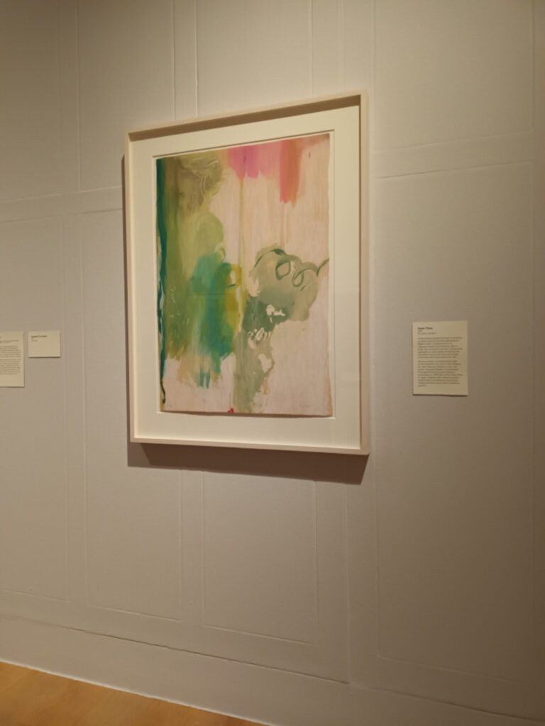
One finds oneself struggling to figure out whether shapes have been carved into the wood or merely a stain applied loosely and printed.
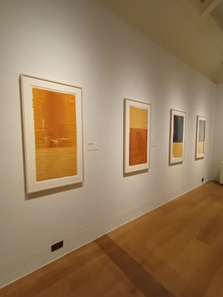
They seem at once spontaneous and to subvert the idea of heavily worked and pre-planned printmaking, until we learn, via the captions, that she often made 50 or 60 artists proofs (some of the captions also reveal up to 32 colours used- though these are difficult to see and presumably are often layers of transparent colour built up).
This seems to have been a way not only to work through ideas visually and hand-on, but also to work in a more solitary way before making an edition with a whole team of master printmakers. Frankenthaler has stated that it was quite a shock to explain everything she was thinking to a team of people- having been used to solitary artistic working.
Though she found it sometimes difficult to work with a team, printmaking seems to have given her the advantage of almost endless iterations of an idea.
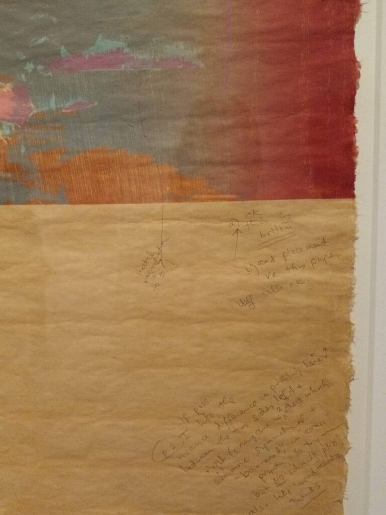
Her methods are shown in the exhibition (to an extent- some still remain a mystery to me), and include masking areas out and collaging prints together, as well as numerous ‘proofs’, often with hand written notes on them.
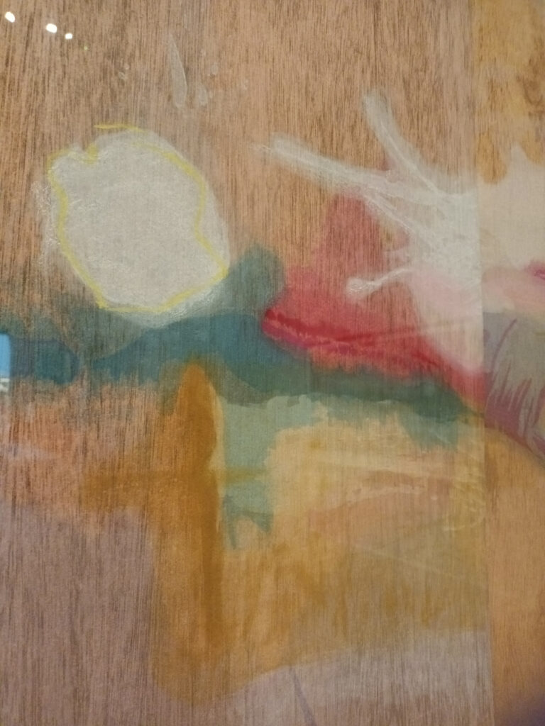
By the 1990’s, she had worked so much in the medium that she had mastered the subtleties of different inks, paints and papers as well as the qualities of the wood itself (‘guzzying’ it up to get more grain and pattern). The exhibition shows the blocks used for ‘Madame Butterfly’, a large 3 block print- interestingly, she seems to have ‘stained’ the block with transparent inks in some parts, and added areas of textured relief in others.
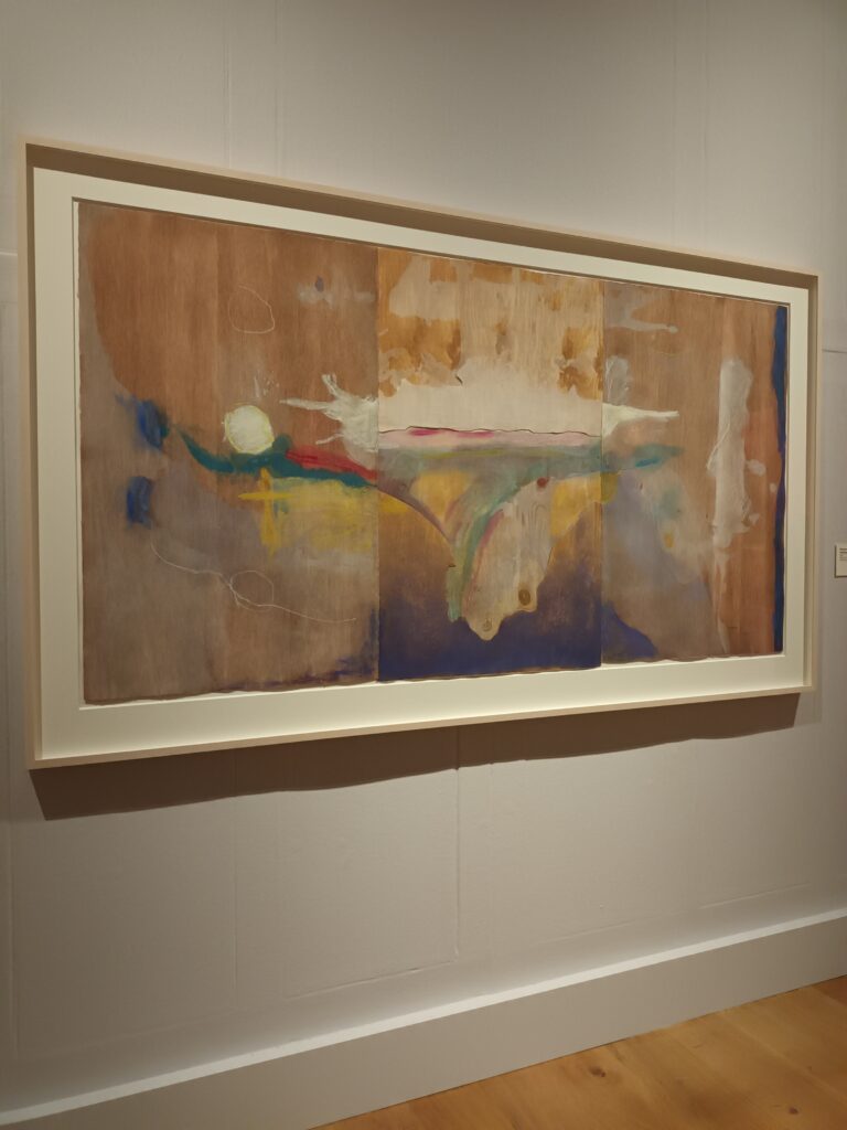
It’s also a joy to see a set of proofs for a print covering one long wall (by no means all of them), showing her handwritten notes and also that at one point she made the decision to turn the print/composition upside down- she was obviously not afraid of the ‘joke’ about not knowing which way up abstract art goes.
The scale of one piece is spectacular- filling an entire gallery wall. It’s so rare to see printmaking of this ambition and scale, and inspiring to see someone attempt it and succeed so well.
Yes, this may be an exhibition for the artists, and more specifically, the printmakers out there- but more than that it exhibits works on paper, of delicacy, depth and beauty and gives them the same respect and admiration as the traditional oil paintings on canvas that surround them in the gallery.
From a personal point of view, it was wonderful to see someone using print in the way I often do, which is to use a multiple as a starting point to jump off from, pushing the constraints of that multiple and using it to work through visual ideas. It’s always a thrill to see the decisions made by an artist- and how many of those decisions there are.
The exhibition continues until 18th April- more information here.